There is one guarantee in the past year: If you post a chart like this, it will get a thousand 'likes'.The first thing to notices is that 3% on the bl
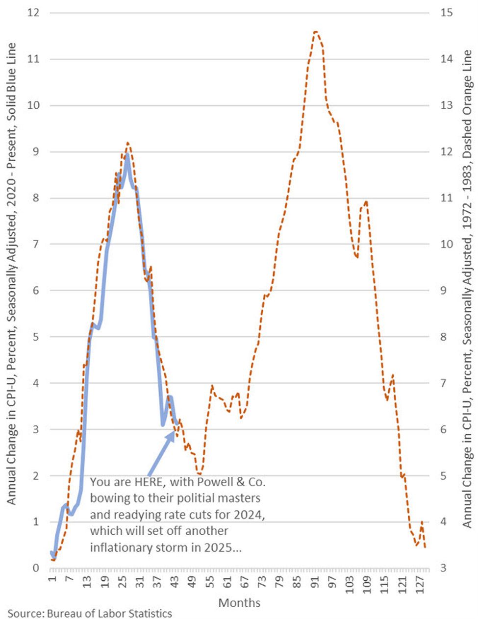
There is one guarantee in the past year: If you post a chart like this, it will get a thousand ‘likes’.
The first thing to notices is that 3% on the blue line is equivalent to 6% on the dotted one. That’s a big difference.
The second thing is that this kind of thing never works. Overlaying charts like this is the worst kind of analysis. It’s a point I’ve made before and will continue to.
This is my favourite response:
www.forexlive.com

COMMENTS